Biorhythm Graphs - background
By Murray Bourne, 16 Jan 2012
I re-developed my Biorhythm Graphs page (for various technical reasons). You can input anyone's birthday and you can see what their state will be (or was) on any day (well, that's the theory).
Biorhythms are interesting, but not at all scientific. They are a quirky example of Composite Trigonometric Graphs, since they involve 3 sine curves starting at (0,0) on your birthday, and having 3 different periods.
Biorhythm cycles - starting from birth
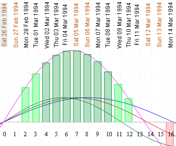
They work on the principle that our bodies, minds and emotions go through various cycles throughout the month, leading us to have pre-determined "good days" and "not-so-good" days. I have assumed the "best" days (colored green on my graph) will be the days when all 3 cycles add to give us the largest amplitude, and the "worst" days (colored red) will be when all 3 cycles push us into the depths of despair.
According to the Skeptik's Dictionary, biorhythms were first "observed" by the Berlin physician Wilhelm Fliess (a good friend of psychologist Sigmund Freud's) in the 19th century.
Fliess originally proposed a 23-day "male" cycle and a 28-day "female" cycle. An Austrian engineering teacher proposed a 33-day "mind" cycle, based on his observations of how well his students performed over time.
They are now known as the physical, emotional and intellectual cycles. Apparently:
There is the 38-day intuitional cycle, the 43-day aesthetic cycle, and the 53-day spiritual cycle.
Head on over and put in your dates here:
Math behind the graphs
Periods: To get graphs having wavelengths of 23, 28 and 33 days, I used these sine curves:
- Physical: y = sin(2πx/23)
- Emotional: y = sin(2πx/28)
- Intellectual: y = sin(2πx/33)
The period of the general graph y = sin(bx) is 2π/b. In the first graph, b = 2π/23, so the period is 2π/[2π/23] = 23.
Composite graph: A "composite" graph is the result of adding the y-values for 2 or more given graphs.
Bars: For the green and red bars used for the "good days" and "not-so-good" days, I used Reimann Sum rectangles. These are used to approximate the area under a curve. (See also this Riemann Sums java applet.)
Conclusion
Don't take biorhythms seriously! However, hopefully you've learned some math from this example.
The link again: Interactive Biorhythm Graphs
See the 8 Comments below.
