Earth killer - composite trigonometry CO2 graph
By Murray Bourne, 09 Feb 2008
Scientists have known for years that the amount of carbon dioxide in the atmosphere has been increasing.
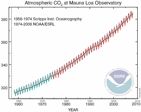
The observations on the top of Hawaii's Mauna Loa volcano have shown a disturbing rise in CO2 over the last 50 years.
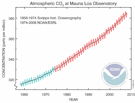
Image source: National Oceanic & Atmospheric Administration
The black line on the graph represents mean data for each year (with some allowance for missing data points). The green and red oscillating lines are the result of natural "breathing" by the Earth throughout the year. In winter, when leaves drop and people burn coal, wood and oil for heating, the CO2 goes up. In summer, as the leaves reappear and there is less fossil fuel burned, the CO2 concentration drops. (This is Northern hemisphere, of course. There is less CO2 in the Southern hemisphere due to lower population, but the pattern will be similar.)
This graph reminded me of a function that I created as an example for this composite trigonometric graphs page. (It's Exercise 1 on that page, the curve y = x2/10 − sin πx.)
So I thought it may be an interesting exercise to model NOAA's CO2 data (1958 to 2008 - original data no longer available) and try some extrapolation to see where we'll be in a few decades time.
A model here means an equation that connects the time variable (horizontal axis) and the concentration of CO2 (the vertical axis). Modeling is a very important concept in mathematical thinking, and unfortunately, most students never get to do any modeling, or even see it being done.
Extrapolate means that we will use the equation that we get to predict what will happen in the future (we can also extrapolate backwards in time.)
Climate modelling is probably the most important mathematics going on in the world right now.
Back to the story...
Using Excel to Model the CO2 Data
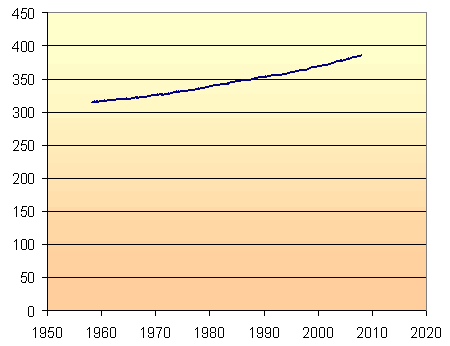
My first graph uses the full zero to 450 parts per million vertical scale, so that we can see that there is indeed a noticeable increase in CO2 concentration over the last 50 years. (In statistics, you can always exaggerate a trend by restricting the vertical scale. This is a common trick in advertising.)
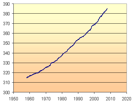
For the rest of the graphs on this page, I have restricted the vertical axis scale, so that we can see more clearly how well the models work.
Linear Model
The simplest model through the given data points is a straight line. Using Excel's "add trendline" facility, and choosing "linear", we get the following:
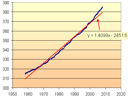
Excel has given us a "line of best fit", with the least variation from the data points. It is not a very good model. Clearly, the slope of the CO2 concentration is increasing as time goes on. If we tried to extrapolate beyond 2008, we would be under-estimating the amount of CO2.
(To see how to use Excel's "add trendline" facility, and for another modelling example, see DJIA Model.)
We clearly have a curve, rather than a straight line, and that curve is likely to be exponential, since CO2 concentrations are related to population growth, which is also exponential.
In summary, I'm looking for a curve that passes through most of the data points and clearly follows the trend.
Exponential Model
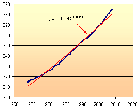
This is the model given by Excel and it is clearly not very satisfactory. It under-estimates at the beginning and end of the data series, and doesn't look much better than the linear model.
The problem, of course, is that Excel is making an assumption that the value at x = 0 (that is, at year 0) is a very small value (in this case, it has chosen 0.1056). However, we know (from Antarctic ice cores) that the CO2 was at a reasonably stable 280 ppm until the beginning of the Industrial Revolution.
There is no way (that i could figure out) to tell Excel to use 280 as a base line. So I subtracted 280 from each of the data points and used Excel to give me a new exponential model. Adding 280 to each of the model's values, gave the following result.
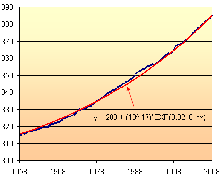
Actually, Excel's model was y = (1E-17)e^0.0216x which was close, but not good enough. I have tweaked this to give the graph of the model overlaid on the original data above.
Now we are getting somewhere. The model fits quite well with the data.
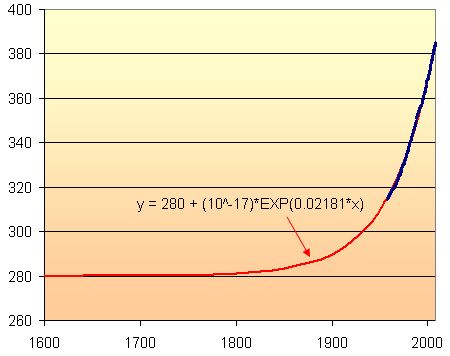
Here is a long-term view of the model, indicating the relatively stable CO2 levels (at 280 ppm) until around 1800 when the madness of coal burning began.
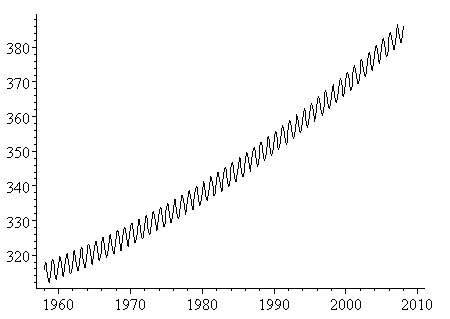
Yearly Oscillations of CO2
The yearly oscillations can be represented by a cosine curve, whose period is 1 year. The amplitude of the cosine curve is just over 3 ppm, derived from observation. There is a slight phase shift since the data actually starts in Jan 1958 and there is a lag before CO2 concentration reaches its peak for the year.
This cosine curve is simply added to the polynomial curve expression, as follows:
y = 3.07cos(2πx-1.2) + 280 + (10^-17)e^0.02181x
This graph (obtained using Scientific Notebook) looked quite close to the original NOAA data.
To check it, I resized and then overlaid the black model graph onto the original NOAA graph (green and red) and obtained:
I'm quite satisfied that the model is a good fit.
In fact, this model seemed good enough to use for extrapolation. So here is 100 years of abuse of the world's air, from 1935 to 2035. We will have managed to increase CO2 levels by around 50% in that 100-year period, assuming the model is close. This is not a good thing.
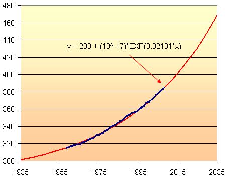
According to this model, the CO2 concentration in 2035 will be about 470 parts per million. This assumes that the current rate of increase will continue until 2035. But with India, China and Vietnam (and many other developing countries) hell-bent on "catching up with the West", it is likely to increase faster than this.
Why it Matters
Throughout the past 1 million years, the CO2 concentrations have ranged between 160 ppm (during ice ages) and were sitting around 280 ppm before the Industrial Revolution. (This information comes from examinations of Antarctic ice down to 3 km depth.) Current concentrations of around 380 ppm represent 869 gigatons (billion tons) of carbon in the air. [Source: The Weather Makers by Tim Flannery.]
The inevitable results of this increased carbon? More warming, more violent weather, more severe flooding and droughts, higher food prices, environmental refugees, etc.
Authentic Data
There is such a great deal of interesting authentic data out there. Why do math textbooks continue to use boring "nice" data (that is easy to plug into some formula) rather than real stuff that actually has meaning and matters?
Disclaimer
The above model is not a climate model as such. All I am doing is modelling the NOAA data as given so that I have a function that I can use for extrapolation. A real climate model will feed in all of the available data and will end up with a much more sophisticated model than this.
See also A simple climate change model.
Endpiece: Polynomial Model Limitations
My first attempts to get a good exponential model were not so successful, so I resorted to a polynomial model. Following is what it looked like.
I am usually reluctant to use a cubic polynomial model, because I find that they are often quite unrealistic either side of the data set and so cannot be used for extrapolation.
However, the following cubic polynomial model (obtained from an online regression utility which has since disappeared) looked very promising.
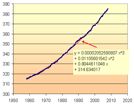
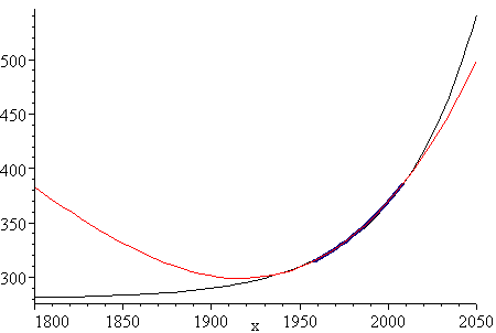
The fit is very good, as you can see. Around 1990 the CO2 increase was quite rapid (probably due to Mt Pinatubo's eruption in the Philippines) and you can see the (red) model graph sneaking through.
However, we can see the limitations of this model when we extrapolate too far beyond the 100 year period of 1935 to 2035.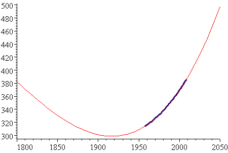
The period where data exists (1958 to 2008) is indicated on the graph (in dark blue). As you can see, the model is quite unrealistic to the left of the data set.
For interest, here is the same graph with the exponential model from above (in black). It is clearly a better model than the polynomial one.
See the 46 Comments below.

10 Feb 2008 at 10:05 am [Comment permalink]
Great post - thanks Zac.
I agree with you - we should use more 'real' data in our math classes.
11 Feb 2008 at 12:10 pm [Comment permalink]
Hi Zac,
I think that the reason the exponential models don't do so well is because they have used only two parameters - with either y=a*b^x or y=a*exp(L*x). It is possible to get a much better fit by taking y=c+a*b^x , which actually makes sense since the exponential growth is presumably being added to a pre-human baseline which was not zero. Of course the cubic, having four parameters, can be made to fit the local data even more accurately, but, as you point out, either model can go wildly wrong if we use it for extrapolating too far from the observed interval.
Thanks for once again putting together the math and data so clearly and attractively.
cheers,
Alan
11 Feb 2008 at 8:27 pm [Comment permalink]
Hi Alan
In one of my attempts I used a y=c+a*b^x model but it was not an improvement on the linear or exponential ones shown. If I get a chance, I'll have another go.
13 Feb 2008 at 3:32 pm [Comment permalink]
Hi again, Alan.
I re-wrote the article after finding a better exponential model. Thanks for your input.
14 Feb 2008 at 5:49 pm [Comment permalink]
Thanks for the analysis, Zac.
As your earlier post asked - What is the point of us? Have we just been put here to foul our own nest? if so, we've done a very good job.
You criticise the use of coal. But for most of the world's poor, it is the only viable source of energy. Is it fair to deny them warmth in the winter, and cooking?
Good on you for using this 'real-life math example' to highlight the problem.
17 Feb 2008 at 3:06 pm [Comment permalink]
Greenhouse effect of CO2 is logarithmic:
Why is the greenhouse effect logarithmic?
Please use a time scale in the hundred of thousands of years.
Your data may also be in error
http://climateaudit.org/2007/08/07/will-the-real-ushcn-data-set-please-stand-up/
Do not scare the children.
BG
17 Feb 2008 at 3:35 pm [Comment permalink]
Thanks for your input, Bruce, but I suspect you have not read what I was attempting to do in this model. Let me address each of your points:
(1) Greenhouse effect is logarithmic? The article you linked to by Pilsen is talking about the effect of an increase in CO2 on temperature. My model is not talking about temperature changes or ice ages - it is simply a mathematical description of the increase in observed CO2. The increase is exponential, as shown above.
(2) Time scale: It would not be logical to use a time scale in hundreds of thousands of years for the data I am using, since people have only been measuring CO2 levels on the top of Mauna Loa for 50 years.
While there is data from Antarctic ice cores, it changes very slowly over time and is not relevant to the current exercise, except as a starting point for the model.
(3) Accuracy of data: I'm at a loss to figure out the relevance of your second link. They are not talking about the CO2 data on Mauna Loa at all and do not cast any doubt on its accuracy.
As far as I am aware, no-one has questioned the accuracy of the data I was using.
(4) Scaring the children: What I am scared about is the rantings by the anti-science lobby funded by big business, especially the oil companies, whose task it is to muddy the climate change waters.
The children should be scared.
26 Feb 2008 at 3:08 pm [Comment permalink]
Great analysis, zac, and great way to show how mathematics can be used with real-world data.
Bruce, your comments don't really make sense here. The data set being modelled are CO2 over time, not temperature vs. CO2. In any case, your conclusions are not shared by the majority of climate scientists or major scientific organizations.
And please provide reasons for your requests. A longer timescale would make the graph harder to read, but would have no significant effect on the model. And I agree, children should be scared (as should we all). They're the ones who will inherit a vastly different world; it's silly to try to insulate them from the dangers they'll face, especially since they have the potential to ameliorate some of them.
29 Feb 2008 at 10:16 pm [Comment permalink]
That Bruce guy doesn't know what he's talking about.
Good post Zac. I also agree the children should be scared - or better still, they should not follow in the footsteps of the adults.
14 Mar 2008 at 3:02 am [Comment permalink]
I've been working with the Pt Barrow CO2 data and the Arctic Polar ice extent data. I found them to be very similar in form. The differences between monthly values plotted out give a similar saw-tooth wave form that can be represented by a sine function with harmonics. Multiple regression yielded three statistically significant harmonics for both sets of data with the signs for the coefficients agreeing. The curve fit was 84% for the CO2 and 95% for the sea ice extent.
14 Mar 2008 at 8:57 am [Comment permalink]
Hi Fred and thanks for your input. Have you published your results anywhere? I'd be interested to see them.
14 Mar 2008 at 10:39 am [Comment permalink]
No. This is a work in progress. This last year I have been looking at all the data I can find related to climate change trying to get at the truth. I retired from EPA over 17 years ago and haven't published in over 13 years. There is too much international politicing the issue to know what to believe. Personally I believe that any greenhouse effect of CO2 is insignificant compared with water vapor and clouds. The observed rise in background CO2 can be explained by a net increase in flux from the oceans as one would expect from a net increase in SST, It's the old chicken or egg argument.
21 Mar 2008 at 8:44 am [Comment permalink]
Hi again Fred. I've been thinking about your comments, especially:
There is too much international politicing the issue to know what to believe.
On the issue of "any greenhouse effect of CO2 is insignificant compared with water vapor and clouds", it is a chicken and egg thing, but in terms of a solution, which should we kill - the chicken?
In The melting Arctic, I quoted Wadhams talking about the effect of all that reflection of heat from white snow and ice turning to absorption because of darker sea water.
And that will certainly cause another rise in sea surface temperature...
20 Aug 2008 at 2:10 am [Comment permalink]
If you look at the CO2 concentrations from the ice core samples taken from Antartica, the last several hundred thousand years shows that today's peak has not yet reached previous peak cycles. I have no doubt humans are contributing to CO2, however, we are also in the rising part of a natural cycle that has occured before. The fact that humans are also contributing during this natural peak is a coincidence but does add to the effect somewhat.
20 Aug 2008 at 2:46 pm [Comment permalink]
Thanks, GDI, but this BBC report talks about current CO2 being "well outside the natural range":
However, data from Oak Ridge National Laboratory (link changed) shows concentrations of up to around 300 ppm within the last 400,000 years.
So it seems that the current 380 ppm is indeed "well outside the natural range."
20 Aug 2008 at 9:48 pm [Comment permalink]
Comparing the ice core 300ppm to the background present day atmospheric measurement of 380ppm is like comparing apples to oranges. First, because the ice core data is an average value of concentrations over from about 100 to over several thousand years depending on depth, while 380ppm is an annual average. When the CO2 is deposited in the ice it's movement, phase, and chemistry are not completely "frozen in time". As long as the temperature is above absolute zero, there is movement in solids. Second, in making the measurement of the concentration, one must have a large enough sample or thickness of ice. Thickness, is the proxy measure of time which is the least accurate factor in ice core studies. We have a multi-variant statistic that is not so simple to treat. We should not try to compare our present day extremes to the last inter-glacial period long term averages.
20 Aug 2008 at 9:59 pm [Comment permalink]
Thanks again for the clarification, Fred. The implication in that ORNL article was "atmospheric concentrations of CO2".
But seems that may not be the case.
14 Dec 2008 at 10:41 am [Comment permalink]
Nice post.
The growth of CO2 in the atmosphere and the accompanying absorption of radiation is a mindbogglingly good way to secure funding, enough to keep several grad students employed (faculty can make careers with them). You need excellent skills in data and plot reading to become a successful CO2 modeler (In my humble opinion). Scientific computing is a sham (Garbage in, garbage out).
The exponential fit can be an awful optimization problem. The planet is doomed. The only future is to leave the earth, resistance is useless.
16 Dec 2008 at 1:11 am [Comment permalink]
It is true that CO2 levels are increasing, but as of yet temperatures or sea levels have not reacted to it. Sea levels are increasing, they have been increasing for the last 6,000 years, but at an extremely low rate of increase. The CO2 increase has not caused the sea levels to increase their level of ascent.
I saw you said earlier that CO2 is what makes Venus uninhabitable(or something of the sort).
That is just not true. The planet just happens to be way too close to the sun! If the Earth itself was a couple of miles closer to the Sun, we would be fried! That's what Venus's problem is, not CO2...
16 Dec 2008 at 11:10 am [Comment permalink]
Josh
You really should read more and base your ideas on scientific data, not your hopes.
According to NASA:
and also from AMES Research Center (also part of NASA):
Yes, Venus is close to the sun, but Mercury is even closer but has a lower surface temperature.
From Spectacular Conjunction, a NASA article:
So once again, Josh, Venus is hotter than Mercury. Mercury is closer to the sun but does not have a runaway CO2-induced greenhouse effect.
You are right in one respect: Earth would be hotter if we moved it closer to the sun. The other way to fry us all is to continue belching CO2 from factories, cars and by burning forests.
I'll go with the NASA scientists, people who have studied these phenomena for years, not a climate change skeptic who is unable to produce any scientific backing for his claims.
Finally:
I'm getting more worried, now that I can see the effect of poor science education in the USA. No wonder we have problems.
18 Dec 2008 at 5:50 am [Comment permalink]
Actually sir, you are outnumbered! Outside of the corrupt UN, support for man-made global warming is waning.
The IPCC report you have cited has only 2,500 scientists that support it.
31,000 scientists and counting believe that man-made global warming is a hoax.
http://www.petitionproject.org/
[newsmax.com article no longer exists]
[canadafreepress article no longer exists]
Do you need anymore?
Another thought on this:
Why is the United States being singled out? China builds new coal plants every day, and they don't have filters on those plants like we do.
China's too smart to be taken in...and they aren't about to stop because Al Gore claims that Kilomanjairo is melting...
I enjoy debating you sir, but I would prefer that you not make disparaging remarks about people who disagree with you.
J.E.
God bless
18 Dec 2008 at 8:35 am [Comment permalink]
Once again, Josh has chosen to ignore facts that are put in front of him.
Notice - no mention at all in his latest comment about my refuting his claim that there is no CO2 on Venus and that its heat is due to runaway greenhouse effect.
Disparaging? Where is my disparaging remark? I have been remarkably neutral in my comments, considering how I really feel. Is this what you regard as disparaging: "...who is unable to produce any scientific backing for his claims"?
Only one thing I agree with - China's contribution to global warming is already immense and will surpass the US's contribution in a few years. Not something to be proud of, by any means.
18 Dec 2008 at 9:19 am [Comment permalink]
What I meant by "disparaging remarks" was this comment, "now that I can see the effect of poor science education in the USA".
How come you aren't commenting on the 31,000 scientists, 9,000 of which with PHD's that are opposed to the idea of man-made global warming?
Now back to Venus:
Even if Venus had no CO2 in its atmosphere, it wouldn't make any difference whatsoever in its ability to support life. More importantly, what's the point of comparing Venus to Earth? There is not much to the planets that are similar...other than size.
Now about evidence for global warming...
What evidence? Getting a computer to run modules of climate change does not qualify as evidence in my book! We need physically verifiable evidence, not computer climate modules.
Al Gore claimed that the ice on Kilomanjaro was melting, and predicted that all ice would be gone by at least 2025, or even sooner than that.
It is a bold-faced lie!
The British government even says so!
(article on nyunews.com no longer available)
The Artic was supposed to melting, but it has been verified that Artic ice levels are increasing!
The British government even says so!
Now for NASA
Are you aware of how much of funding NASA gets to fund climate change studies? NASA needs the money, and like someone else on here said, conducting studies on global warming is a great way to get funding. Like someone once said, "Follow the money".
NASA needs money, because a lot of people in our Congress have cut funding to the organization(something I don't like by the way).
That's my view anyway, but my original point was that the so called "consensus" doesn't really exist. Not if 31,000 scientists have anything to say about it!
God bless
18 Dec 2008 at 9:20 am [Comment permalink]
Oops, the British government does not say that Artic ice levels are increasing, mix-up on my part...
18 Dec 2008 at 9:37 am [Comment permalink]
I rest my case.
27 Jun 2009 at 5:17 pm [Comment permalink]
Thanks, Fred for the paper. You present some interesting arguments. I'll ponder them further...
25 Aug 2009 at 6:18 pm [Comment permalink]
Really agree with you sir. Just a bit touch of reality makes practical sense and doesn't let anything get boring. Students often get bored on the topic that what they are studying makes no sense until they are visualized about what they are studying and about to study.
14 Dec 2009 at 4:11 pm [Comment permalink]
Well said, Josh! Zac seems to think that
"However, scientists believe Venus did experience a global runaway greenhouse effect about 3 billion to 4 billion years ago."
is scientific evidence of any relevance to climate change on Earth.
It may well be true that too much CO2 is bad for life on earth. Inarguably, too little CO2 is even worse. How does this lead you to some idea of the optimal concentration?
Mathematical modeling is fundamental to all good science. The math part is relatively easy. But you can fit curves to data in so many ways that you need a reason to believe that the fitted curve is of any value in extrapolation.
The honest way to do this is to run experiments which test the validity of projections made from the fitted curves. In physics and chemistry, millions of such experiments have been done in an attempt to contradict proposed models. Only a few such models can withstand this pressure. Even then, the scientist continues to probe for inconsistencies.
This CO2 modeling nonsense is science at its worst. You take a set of data. You make some random observation like "population grows exponentially" (it does not) Then you reason that CO2 is related to population (with no evidence as to how). There is no attempt to test with out-of-sample data.
In the background is a political agenda to limit economic growth and increase dictatorial poweres in the hands of a few experts. The correlations asserted between CO2 concentration and climate are laughable, even as pure math.
Maybe simple artificial examples presented honestly would be better for students than to follow the latest pop science craze. I do agree with the comment "children should be scared"...but not of climate change.
15 Dec 2009 at 5:10 pm [Comment permalink]
So Mike, which oil company do you work for?
15 Dec 2009 at 5:56 pm [Comment permalink]
Why do you exclude the impact of our Sun's solar maximum and solar minimum cycles in your analysis? I have also seen data that shows that ice ages occurred in the past when CO2 levels were as high or higher than they are today. Why is this not accounted for?
15 Dec 2009 at 10:34 pm [Comment permalink]
Graeme,
Based on your comment,it seems you have bought into an agenda that has blinded you from seeking scientific truths. I believe I am a pretty good environmental scientist having done research in EPA since it's beginning until I retired eighteen years ago. One reason I retired early was because objective research was being side tracted for political purposes. This year EPA's endangerment findings is the grave marker for objectivity at an agency that once had a reputation for good science. http://www.carlineconomics.com/. I believe Mike has a better understanding of how it really is than you do. I probably know more about science and math than Mike. To check on my credentials, google "Fred H. Haynie" with +climate,or +statistics, or +economics,or +corrosion, or +thermodynamics. Other publications can be found with "Fred Haynie" but there are other Fred Haynies.
15 Dec 2009 at 10:57 pm [Comment permalink]
Graeme...thats a great example of what's wrong with politicized science. You don't care about the truth. As it turns out, I do not work for any company. But even if I did, what difference would it make? The science of climate fluctuations is in its infancy. I am unaware of a single controlled experiment to verify that a model made predictions consistent with out-of-sample experimental data.
It is bad enough that the math and stat reasoning in the social sciences is often nonsense. Now you want to infect the hard sciences with your ignorance.
Perhaps you can reveal what snake oil company YOU work for.
6 Mar 2010 at 4:24 am [Comment permalink]
Global warming and CO2 increasing are two different issues.
CO2 increase has a logarithmic affect on the increase in temperature:
[junkscience.com no longer available].
But as the author carefully is pointing out, the increase in CO2 may be exponential. That might mean a nearly linear (more or less) increase in temperatures, should the co2 increase continue exponentially.
As a skeptic, I salute the logic in this blog. But we cannot ignore logic from any source simply because of its source. Even should the "skeptics" be "deniers" who have no knowledge or degree (I'm a trained mathemetician, but not a climate scientist).
So where does this leave us? If more CO2 is being produced than can be absorbed by the Earth, and it increases exponentially, we will have negative affects. At the very least, if we reach 2000 ppm of CO2, it will make it difficult to breathe and we will have past the point where plants are helped by having more co2. That would truly be a runaway effect, if plants could no longer efficiently absorb co2, and it became difficult to breathe. But the temperature would still only have raised a few degrees.
In other words, exponential CO2 increase may cause huge problems even if global warming is overstated.
6 Mar 2010 at 10:47 pm [Comment permalink]
Eschatologist,
Don't buy the exponential rise in CO2 concentrations statistically associated with the exponential burning of fossil fuels. Being trained in math you will find that a segment of a sign wave will give you a better fit of the Mauna Loa data than an exponential curve. First, factor out the seasonal cycle. Then fit the data to sine(2*PI*years/a+b), where a is the cycle length in years and b positions the cycle. Use trial and error for a and b to maximize R square. Hint, start with "a" at 350 and vary "b" to maximize R square. then change "a" and repeat. Continue the process until you have found the maximum. This is a natural cycle that can be projected into the future. I predict that CO2 concentrations will continue to rise but at a slower rate and max out in the last half of this century between 500ppm and 600ppm.
7 Mar 2010 at 1:14 am [Comment permalink]
Well stated arguments, however, approximately 97% of all CO2 put into the atmosphere is caused by natural sources. If all humans disappeared today, over time, we would expect to gradually see a decrease in global CO2 output down to the natural level only.
The question is, would a complete elimination of all human produced CO2 dramatically alter the course? We should expect the growth in global CO2 to slow by the same amount of human produced CO2, but would natural sources continue to increase atmospheric CO2 levels?
With all human derived CO2 being eliminated in this scenario, I suspect we would still see a continued rise in atmospheric CO2 due to the naturally produced CO2.
7 Mar 2010 at 12:43 pm [Comment permalink]
Also, regarding the comments earlier in this post about the comparison of Venus vs. Earth. Yes, Venus' dense CO2 atmosphere keeps surface temperatures on that planet hot enough to melt lead. However, Venus' atmosphere is 93 times the mass of our atmosphere on Earth, with surface pressure 92 times that of Earth.
With that difference in atmospheric mass, and the fact that Venus' atmosphere is mostly CO2, while our atmosphere is mostly Nitrogen, you really cannot compare the two planets in an argument about global warming.
5 Oct 2010 at 4:59 am [Comment permalink]
I am saturated with the content of this blog - I really feel for the poor student who started it all in innocence.
It has been hijacked by extremists .. I see this more and more all over the net .. it's like there's these boxing arenas popping up everywhere and the prizefighters go there to slag it out with all their ifs and buts and clever language and their clever clever links to obscure publications where you will find contradictory evidence to ... well, whatever you want really.
I implore you all to take only this from the entire thread: if a proclamation went out tomorrow that the earth was flat, what would happen (yes, I dare you to try it!) ... every scientist worth his/her salt would ignore it, but there would be an avalanche of 'flat earth believers' who would see their chance to finally turn the books on everyone and they'd sign up in droves. That would be of no consequence. On the matter of AGW however ... how sad, and how sad for our planet. It's an old cry "empty vessels make most noise" - so true today as in the days of our (more fortunate) ancestors.
21 Oct 2010 at 7:04 am [Comment permalink]
I'm sorry to say that this blog will be as subjective and qualitative as the rest have been. First though, I'd like to say that I want to see an expression/model for the discrepancy between the long-running ice core CO2 data and the actual measured data from Hawaii. Although at the same time, I know it will only support my beliefs. As it could be interpreted to support the beliefs of the other side.
I'm just sad to see an exercise so fundamental in understanding everything ignored by people who can't focus on their work, bills, and taxes let alone anything else.
-sorry
21 Oct 2010 at 8:10 am [Comment permalink]
Why not use Dick Cheney's 1% Doctrine - If there's a one percent chance of a terrorist threat to the USA becoming real, then it should be treated as if it WILL IN FACT come to pass, and acted on.
Global warming, if the predictions are accurate, is definitely a threat to not only the USA, but the rest of the world as well. Why we choose to deny it until it bites us in the as$ is not proactive, but reckless.
By the way, some of the same public relations individuals that were paid to convince us that cigarettes aren't harmful are now employed by the oil companies in the attempt to distort and water down evidence on global warming.
21 Oct 2010 at 2:37 pm [Comment permalink]
@Paul C. This may be taking us away from the main intent of Murray's post (which was just to show how to construct a mathematical function whose graph passes through a particular kind of data set), but with regard to ice core bubbles and mountain tops, I wouldn't necessarily expect the CO2 concentrations to match because the seasonal variation might be washed out due to the time taken for the ice to form, and some gas in the bubble might dissolve in the water that was created as the snow compacted to ice. (However, unless CO2 can dissolve into and migrate through the ice, I *would* expect that the concentrations in ice core bubbles at different depths might be directly related to that in the air at the times they were formed.)
10 Dec 2010 at 2:07 am [Comment permalink]
All the O2 we breathe today came from CO2, if there was no carbon based life (plants and trees) caused by CO2, causing new carbon based life, (you and me,)the Air would be all CO2, and there would be no nitogen caused by decomposition of dead life. There are a dozen causes of climate change missing from the U.N. study and 175 years of CO2 science missing from the U.N. study, CO2 has been a proven refrigerant for the last 175 years. Yes we have climate change for the last 4 billion plus years, no it is not caused by the cause of all carbon based life. Co2 is the by product of warming not the cause, there is 70 times more CO2 in the ocean than in the Air, life comes from the ocean. please go to http://co2u.info, Thank you, Bruce A. Kershaw
21 Dec 2012 at 12:35 am [Comment permalink]
12 lucky people need to be chosen to be shot into space to find another planet to populate.
7 Dec 2015 at 5:49 am [Comment permalink]
so we are now in 2015,the worst scenarios have actually materialised and those who spent billions in order to convince humanity that all is going well and there is no reason to worry ,are hiding behind their wealth and high walled villas,and await to see what will transpire as a result of their doings.
Greed has reached humanity at the lowest possible level.And as it seems ,we havtn learnt nothing.
Otherwise ,teachers and parents would do everything to bring up the young generation without the perverted ideas that brought us here in the first place,(ideas like consumerism,allowing big firms to act with impunity and of course the main capitalistic ideal of war that brings profits and growth.
Well it does,unless you are at the receiving end of the bombs.
17 Jun 2019 at 10:24 am [Comment permalink]
I am a geologist. I commonly hear colleagues saying that way back when CO2 in the atmosphere hit peaks as high as 4550ppm and so we needn't worry about the end of life etc etc etc.
However, since 1824 it has been known that CO2 is one of several greenhouse gases and in 1827 it was suggested that CO2 could affect global climate; Fourier was involved in this, if I recall correctly. Arrhenius (1896) modelled CO2-induced cooling to see if it could cause an ice-age and then reverse modelled to investigate the heating effect and came up something not far-fetched. So there is nothing new about the notion of CO2 induced climate change. The concept was taught in my British primary school shortly after the 1957-58 international geophysical year.
The absolutely key thing utterly ignored by fellow geologists and other "deniers" is that no species has ever added greenhouse gases to the atmosphere at the rate we MUST have done since coal mining began in the UK in perhaps the 1640s and the steam engine was invented in 1735. Nor has any species in geological time burnt as much fossil fuel at the rate we have whilst breeding like the proverbial rabbit and inventing AK-47s, B-52s, MIG-something-or-others and nuclear weapons owned by politico-religious systems controlled by psychopaths and full of stupid young men in the age bracket 16-28 who relish the opportunity of becoming warriors and heroes (normal young male behaviour as a result of evolution but now a trifle inappropriate in a globally interdependent civlisation).
Yes, volcanoes erupt but geologically that is a steady state system based on continuing plate tectonics. Yes, the sun has got hotter during geological time but that is geological, not historical, time. Yes, blue-green algae/bacteria etc changed the Earth's early atmosphere to one containing adequate oxygen for multicellular life, but that took around 2.6 billion years or thereabouts.
Finally, if we reduced CO2 in the an atmosphere by 130ppm from the pre-industrial 280ppm we would all die from frostbite as a global ice-age set in. So yes, adding or subtracting what are rather small amounts of CO2 (small when compared as a percentage of total gases in the atmosphere)does have a major effect.
Denying Anthropogenic Global Heating is to deny sanity.
I enjoyed your modelling even though not a mathematician. Maths is very, very important, even in geology. Thanks.
18 Jun 2019 at 4:52 am [Comment permalink]
@Bob: The "top" scientists of the day who thought Earth was flat and that it was the center of the universe, and that it was only there for exploiting were initially skeptical about claims to the contrary. Most of such people have been won over by overwhelming scientific evidence, and yet some persist.
It is right that scientists like your colleagues question the latest fads - but there comes a point...
18 Jun 2019 at 9:39 am [Comment permalink]
Thanks for the quick reply. The problem with referring to the geological past as proof that AGH isn't happening and it is merely natural, is quite simple. We have a new variable in the global system: Homo sapiens who is burning ever more of an awful lot of stuff to stay comfortable and improve personal status and who has multiplied its population 10-fold since 1750 and increased its aspirations and weaponry probably even more according to some non-linear mathematical equation.
The potential for AGH is simply a matter of physics, as determined back in 1824.Just add in the then unimaginable societal mix of today. Arrhenius had a go in 1896 but even he could not conceive that within 100 years the global population would have increased 7-fold and our use of hydrocarbons for comfort would have sky-rocketed with results that to any scientist should have been reasonably predictable, had they then seen the future.
The other aspects that are of interest is the impact we actually have made in the pre-industrial past through changes in agricultural practices etc. It seems to me that there is an interesting coincidence in time between the Black Death and the Mongols invasions of the near East and Europe and the decline of the Viking settlements in Greenland. We were on a warming trend in the early part of that millennium and then it got colder. Possibly a natural trend with a human hiccup on top as 1/3 of agricultural Europe died out in the Black Death and the Mongols disturbed assorted farming-based civilisations from the 1200s onwards.
One paper I came across has suggested that the European invasion of the Americas changed Amerindian agricultural practices to the point where trees growing in place of crops sucked out enough CO2 to help trigger the Little Ice Age in Europe.
All rather entertaining scientifically; my grandchildren are in for interesting times.
Thanks for the newsletter; I enjoy it even though at the age of 6 I got kicked out of the class for not understanding how to add up in tens,, hundreds and thousands. However, at the time I had no problem with the bases 12,20 and 21 of the English monetary system. And finally, who invented logarithms and how did they work them out? I had a go at it once using square roots and cubed roots.