Gaisma - real-life sine graphs
By Murray Bourne, 13 Feb 2007
Gaisma has
"Sunrise, sunset, dawn and dusk times around the World!".
There is a graph for each city and they are (almost) sine curves.
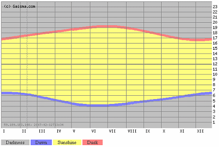
The yellow portion represents daylight, the gray represents night and the blue and red represent dawn and dusk. The horizontal scale is months in the year and the vertical scale is the hour of the day.
This is the one for Tokyo (northern hemisphere):
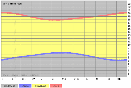
Capetown, South Africa, is in the southern hemisphere, so the graphs have the opposite shape (in a vertical sense).
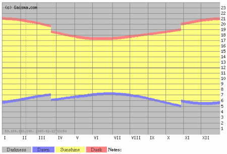
Many places use daylight saving, and so there is a discontinuity in the graph. For example, Melbourne in Australia has:
There are some really strange graphs for places above the arctic (and below the antarctic) circle, like Tasiilaq, Greenland.
Now, the challenge is to model the graphs (find an equation for them), since they aren't exactly sine curves.
Oh, and:
"Gaisma" is a Latvian word, meaning "light".
It's an interesting site.
See the 5 Comments below.
