Math and color blindness
By Murray Bourne, 25 Jan 2010
Color blindness is caused by a problem in the red, green or blue cones of the retina and is most often genetic in origin. It affects males almost exclusively.
Color blindness is not evenly spread across different ethnic groups. Around 8% of Caucasian men, 5% of Asians, and 4% of African males have the most common type of color blindness — the inability to tell the difference between red and green.
As an example of the difficulties faced by those who cannot distinguish red and green, here is how a red apple is perceived by a deuteranope (someone with the most common red-green color blindness) .
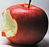
Red apple as perceived by a normally sighted person (left) and by a color-blind person (right).
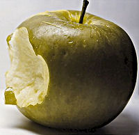
Now we see how a green apple is perceived by a deuteranope.
Green apple (left) and as seen by a deuteranope (right).
As you can see, there is very little difference in the perceived color for the 2 apples and therefore it must be quite a challenge to go grocery shopping. We distinguish many vegetables (including the quality of those vegetables) by their color.
Note that color blind people see some color (it's not blank or invisible), but they don't distinguish green and red.
Check how color blind people see your images and text
I obtained the apple images on the right above using the excellent facility at VisCheck, which has since disappeared. You can upload any image and see how it will look to people with different kinds of color blindness. A possible alternative: Color Blindness Simulator
Colors of the Rainbow
Here are the rainbow colors, with the way a color blind person would see them.
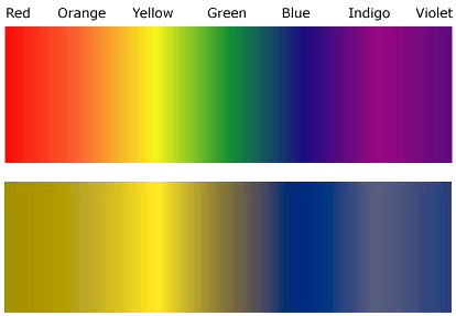
Colors of the rainbow - normal (top) and as a color blind person sees it (bottom)
The Ishihara Color Test
Shinobu Ishihara published tests for color blindness in 1917. They consist of circles with numbers embedded using different colors, as follows.


Ishihara Color Test Plates
Note: If you have trouble seeing numbers in the above plates, it does not necessarily mean you are color blind. Each computer monitor has different settings and capabilities. Color blindness tests should only be done using paper print-outs.
Color blindness and learning math
Let's now look at the implications of color blindness for math students.
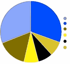
Here's a pie chart that could be used as part of a statistics lesson. The colors are unsaturated, making it difficult to read.
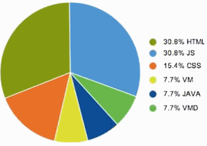
Pie chart original
And now for the version that a color blind person sees.
Pie chart as seen by a deuteranope.
What if the teacher asked a question like "What percent is represented by the orange sector?" The brownish colors are almost indistinguishable and this would make interpretation of this chart quite difficult.
Notice that the order of the items in the legend does not follow the order of the sectors of the pie chart, so there is a double whammy for anyone trying to figure it out.
What colors should we use?
According to Okabe and Ito in the very useful article Color Universal Design, the following are good practices to follow when developing materials.
Principles of Color Universal Design
- Choose color schemes that can be easily identified by people with all types of color vision.
- Use a combination of different shapes, positions, line types and coloring patterns, to ensure that information is conveyed to all users including those who cannot distinguish differences in color.
- Clearly state color names where users are expected to use those names in communication.
No matter what the background color of your presentation, Okabe and Ito advise to avoid red, orange, yellow, yellow-green and green, if such colors are important for distinguishing information. That last bit is important - you don't need to avoid these colors if they enhance the visual appeal for normally sighted people.
A lot of presenters use color for emphasis, but it can be lost on some viewers.
For example, the following could possibly look all black and so the emphasis is lost.
Dark red characters amongst black text
The following at least will be clearer.
Dark blue characters amongst black text
But please don't use blue too often on Web pages, since this is traditionally the color for links and should be avoided.
Back to the Pie Chart
Let's go back to our pie chart and try to improve it. Here's the chart again with better, more saturated colors. I have used magenta (equal amounts of blue and red, or #ff00ff in color hex) for one of the sectors. Note it looks light blue to a color blind person. Also observe how dark red (#c00000) and light green (#00ff00) appear.
Pie chart with saturated colors (left) and how it appears for a color blind person (right).
It's better, but far from perfect.
The legend (the dots on the right of each image) adds extra cognitive load for everyone. If we label each sector as follows, it is easier to read and understand.
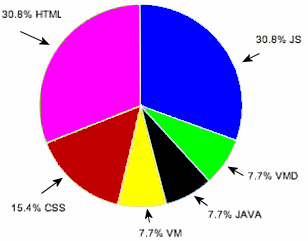
Easier to follow pie chart
Line Graphs
Here's a graph from a page I wrote illustrating Vector Addition. (We're adding 2 vectors, A and B, and the resultant vector is R.)
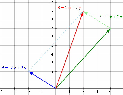
Adding vectors (original)
I chose primary colors (blue and green for A and B), and "red" for the "resultant" (R), which is fairly commonplace. But look how disastrous it is for a color blind person:
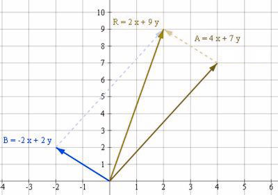
Adding vectors as seen by color blind person
In this case, the vectors are clearly labeled, but the colors do not help at all.
I changed the script to replace green with black. I'm still using red (in the original) for the resultant vector, but I think you'll agree all colors are distinguishable now.
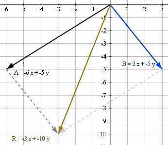
Blue, black and red vector arrows, as seen by a color blind person.
Redundant Coding
Here's another kind of line graph that's found in statistics. It shows a projection of the population by age for the USA.
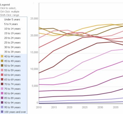
Projected numbers of people per age cohort, USA. (Original)
Here's how it looks to a color blind person.
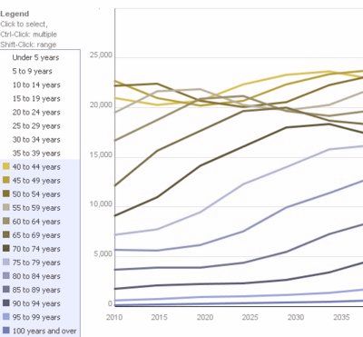
Line chart - as seen by a deuteranope.
As we've seen in the other examples, it's better to label the lines in a chart (rather than use a legend), and to use different patterns (square, triangle, cross, etc) on each line. This is called redundant coding, since we are differentiating the information in more ways than one.
Here's a better version of this graph, with redundant coding.
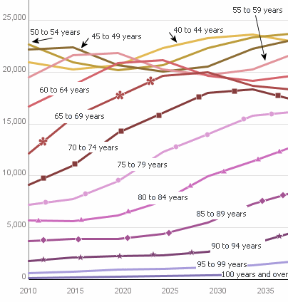
Line chart with redundant coding.
I didn't change the colors (since that would have produced limited benefits).
It's also best to use thick lines when drawing graphs, since thin ones are more difficult for color blind people to see.
Avoid Certain Color Combinations
Even normally sighted people have difficulty reading certain color combinations. Particularly on Powerpoint slides, it is irritating trying to read red or dark blue text on a dark background, something like this:
Bad enough for normally sighted people, but disastrous for color blind people, as follows.

The usual rules apply for Powerpoint slides - use highly contrasting colors - the best is black on white. Here's the same text in a form which is easier for everyone to read (black on white):
Conclusion
We can't assume everyone in an educational setting can see things the way we see them (in fact, that's almost always the case on many levels, not just color perception!).
Proper labeling of graphs, charts, equations and avoiding indistinguishable colors will certainly help improve readability for all learners - not just the color blind ones.
I realize now I need to go back and fix a lot of my own graphics so they are more readable.
Don't get me wrong - still use lots of color in your presentations, but keep in mind the needs of those 5% or so of readers who are color blind.
Please comment: Are you color blind? I'd love to hear your feedback or corrections on anything I have written here.
Image Credits
Red apple by Bulinna [original no longer available] CC BY 2.0
Population Projections (by IBM)
See the 19 Comments below.

26 Jan 2010 at 2:56 am [Comment permalink]
I'm color blind, and I can't see any difference between the two images of the red apple and the two images of the green apple.
However, you state that it would be difficult for a color blind person to tell the difference between a green and a red apple, and I don't believe that's true; or at least not for whatever sort of color blindness I have.
There is some kind of clear difference between the red and green apple images. Not hue necessarily, but maybe brightness or some other aspect. Furthermore the other visual attributes of the apple make distinguishing between the two types quite easy. Maybe I'm just used to looking for those traits as they are what information I have available to make that distinction.
I'd also like to say that your point about charts and graphs is spot on. It was *incredibly* difficult and frustrating to get by in school, and even today I regularly encounter charts and graphs that I cannot use. The most frustrating occurrences are when the information comes from a government source, like weather radar, that is supposed to be equally accessible to people with disabilities (though surely color blindness is one of the most mild possible disabilities).
My last item to share is that, for me at least, what range of colors I can distinguish is related to whether the color is reflected or projected. That is to say that when printed on paper, some colors are indistinguishable, while I can tell those same colors apart just fine on a computer screen, and vice versa. For example I never know whether the traffic light I'm approaching is displaying flashing red or flashing yellow, until I am close enough to see the position of the light relative the unlit bulbs. It's unsafe, and frustrating to know that a more thoughtful color scheme would eliminate the problem.
26 Jan 2010 at 9:10 am [Comment permalink]
I taught(and teaching as well) some colour blind students.
For some student I've used different colour paper (mostly blue) for them to write and avoid some colour pen to write on te white board.
I've found this article useful and intersting. Thank you.
26 Jan 2010 at 9:20 am [Comment permalink]
@John: Thanks for your input. The skin texture (and pattern) of the 2 apples is quite different and I imagine this is helping you to distinguish them. But what I'm interested to know is how accurate the VisCheck images are. To me, on my monitor, the colors of the right-hand images are basically identical (a yellowish-brown). Is that how you see all 4 apple images?
@Salagadevi: What do the students say about the blue paper? Does it help them?
26 Jan 2010 at 9:28 am [Comment permalink]
Thanks for a great article. This entry has a very nice explanation of color blindness and examples. Even though I'm not colorblind myself, I had a friend who is color blind, and he is usually the first to comment on my schoolwork and presentations that it's hard for him to read. After I knew the fact, I tended to stick to high contrasts. He said once, that if there's red and green right next to each other, he can tell the difference, but not if one appears at a time.
And now I'm in a university, I have another color blind classmate. This guy's problem is serious. He seems to get all the pH readings (in chemistry classes) wrong, and don't even know what he's looking at until the whole thing turns blue. Fortunately his "lab buddy" later took the responsibility of color-sensitive instructions. I don't even to think what will happen to me if I'm colorblind.
Again, this article is a win. Already tweeted, and I hope somebody will retweet it too.
26 Jan 2010 at 12:10 pm [Comment permalink]
Hello Zac. Yes, the images appear almost precisely identical. The two images of the green apple are perfect. The red apple images are very close, but the apple on the right appears every so slightly different. It's as though it is perhaps a hair darker or more saturated, and the difference is only visible in the area of the specular highlight. Maybe it's a peculiarity of my specific deficit.
Thanks for you work on this topic.
30 Jan 2010 at 3:11 am [Comment permalink]
Thank you so much for taking us color blind people in mind. It's the first time I see somebody that considers us. I could not see any diference in any of your examples, because, again, I am color blind. Excellent idea to use the different shapes in conjuction with the colors. I have suffered a lot when it comes to interpreting charts all my life.
30 Jan 2010 at 8:13 am [Comment permalink]
Thanks for your input, Victor. Hopefully this article will raise awareness.
3 Feb 2010 at 3:13 am [Comment permalink]
Hey, Zac,
Thanks for having written a "home run" of an article on graphic design for color blind audiences!
While I currently work as professional tutor, I taught in the classroom for over ten years. While I was aware of the issue of color blindness during those ten years and knew to look out especially for red-green combination, I didn't know much else. I was reduced to putting writing some sample words in red and green and then asking my class whether the ink looked the same or different. This exercise usually ended up turning into a teachable moment for the students without color blindness.
Your advice on designing with a universally accessible color palates was superb, and it was terrific to read John's validation of your ideas and presentation.
Thanks ever so much... this is the *best* resource I've ever found for this issue and I will certainly use it as I use color extensively as I tutor students.
-John Hocutt
Mr Math & Science Academics
3 Feb 2010 at 3:50 am [Comment permalink]
There are degrees of colour blindness. In 1st year Biology Dr John Stir covered colour blindness, and ran some tests in a lecture, to try to explain how it worked. Coung, Brian and I are all red/green blind, but in different degrees. Coung sees the grass and trees as brown. His red/green cones just don't work or are missing. Brian is slightly low in them, and I am somewhere in between. When Coung and I were using Universal Indicator in the lab we really struggled to match the paper with the charts - Coung had no clue, and I could only decide on fairly wide ranges.
The genetic prevalence of it varies quite strongly by race - up to 30% of Asian males are red/green blind to some extent, while Nordic males have a very low incidence.
The other interesting thing is that the fairly high incidence (12%) of red/green blindness is due to the advantages it gives in a hunter/gatherer society. Camouflage does not work well for the colour blind, so in times of famine the colour blind male is the best provider, and as a result his kids are more likely to survive. Come the nuclear winter I and my children will fare much better than all you "normal people". Mind you, electrical wiring is fraught with peril - differentiating the red, green and brown wires can be a challenge!
3 Feb 2010 at 7:24 am [Comment permalink]
Thanks (both) Johns for your valuable additions.
As an update from me - it's interesting how the examples in this article appear quite different on different PC monitors.
So you may not quite see what I am talking about, depending on your monitor and its settings.
3 Feb 2010 at 11:31 pm [Comment permalink]
As some colleagues above have commented, I also find this article very informative. Very soon I will start teaching students in a University, so I now know how to guide them in their final year projects as every student is required to write a report and a presentation using MS-Power ponit. Once again thanks for the timely article.
21 Feb 2010 at 11:59 pm [Comment permalink]
Hi! Very nice blog! I'm a geographer who felt in love with statistics. Certainly I will use this post when make some thematic maps.
Regards,
Raphael Saldanha
Brazil
4 Aug 2010 at 5:38 pm [Comment permalink]
i liked your posted article i got to know many new thing about color blindness this is going to help those who are suffering from color blindness because in this article everything is explained nicely,hope u will continue this job in the future.
25 Oct 2010 at 9:13 pm [Comment permalink]
Great article. I just took the Ishihara color blindness test and got one wrong. Does this mean I have a color blindness? I passed everything on this page though.
17 Dec 2010 at 7:34 am [Comment permalink]
[...] taken color-blind individuals into account. The map designers would be well advised to read this squareCircleZ blog on color blindness and color choices for graphics and presentations and Okabe and Ito’s web page on color universal [...]
24 May 2012 at 12:50 pm [Comment permalink]
THANK YOU so much! for all of this information. I am a relief integration aide and worked with a 5yr old boy today, who i was told, did not know his colours. After spending 2-3 min with him i suspected that he may be colour blind due to the repeated confusion specifically with GREEN, RED & sometimes BLUE. This informative article supports just that.
MANY THANKS!
7 Feb 2014 at 2:00 am [Comment permalink]
Thank u so much it helped me understand my son who is 4 and was told to me two days ago that he is color blind I'm still trying to figure out how I'm going to help him and myself but just seeing th pictures now I know how he see the world
2 Sep 2016 at 7:34 am [Comment permalink]
Thank you. I am teaching a 5th grade class. One of my students is strong red/green color vision deficit. We use black on red and black on yellow quite a bit. His reading is strong, but math is difficult. Are there any connections with color deficit and math dyslexia type learning struggles/patterns? Thanks so much. P.S. My maiden name is Bourne - our family had a ranch in Bolinas CA in the early 1900's.
4 Sep 2016 at 10:46 am [Comment permalink]
@Gianna: Hello, fellow Bourne!
I hadn't heard of a connection between color blindness and dyslexia. This short article indicates probably not: Is there a link between colorblindness and dyslexia?
As I mentioned in my post, some students will have difficulty with the way math is presented, especially color use in graphs, and also use of color to emphasis parts of equations, or steps in solutions.