The Gini Coefficient of wealth distribution
By Murray Bourne, 24 Feb 2010
In a "perfect" society, everyone would share wealth (or income) evenly. (Don't worry - this is an article about math, not communism!)
The Gini Coefficient is one way to measure how evenly the income (or wealth) is distributed throughout a country.
The Gini Coefficient is calculated as follows. We find out the income of all the people in a country and then express this information as a cumulative percentage of people against the cumulative share of income earned. This gives us a Lorenz Curve which typically looks something like the following.

In plain English, the graph above indicates the proportion of the income going to the poorest people, middle-income people and richest people.
There will always be rich and poor, but we are interested in how evenly wealth is distributed and most governments put effort into keeping this coefficient as low as possible.
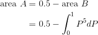
The Gini Coefficient ranges between 0 and 1 (or it can also be expressed as a number from 0 to 100) and is given by the ratio of the areas:
![]()
If A = 0, it means the Lorenz Curve is actually the Line of Equality. In this case, the Gini Coefficient is 0 and it means there is "perfect" distribution of income (everyone earns the same amount).
If A is a very large area (making B very small), then the Gini Coefficient is large (almost 1) and it means there is very uneven distribution of income. Countries with a high Gini Coefficient are more likely to become unstable, since there is a large mass of poor people who are jealous of the small number of rich people.
What Does it Mean?
Let's try to understand the above graph.
For example, say we have 10 people in a village and the income for the village is $100 per day. If every person shares this income evenly, they get $10 each per day.
So the income distribution would be as follows. ("Cumulative" just means add up the number you have so far for each step.)
| Person | Proportion of population (%) | Cumulative proportion of population (%) | Income (%) | Cumulative income (%) |
|---|---|---|---|---|
| A | 10% | 10% | 10% | 10% |
| B | 10% | 20% | 10% | 20% |
| C | 10% | 30% | 10% | 30% |
| D | 10% | 40% | 10% | 40% |
| E | 10% | 50% | 10% | 50% |
| F | 10% | 60% | 10% | 60% |
| G | 10% | 70% | 10% | 70% |
| H | 10% | 80% | 10% | 80% |
| I | 10% | 90% | 10% | 90% |
| J | 10% | 100% | 10% | 100% |
So for this society with perfectly-distributed income, we could draw a graph of the cumulative proportuion of population (on the horizontal axis) against the cumulative percentage of income (on the vertical axis) as follows.
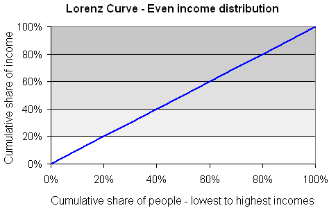
In the above case, A = 0 so the Gini Coefficient is 0.
Now, people being people, some of the villagers decide they should be paid more because they work harder, or because they are older, or because they have more children, or whatever. So three of them (persons H, I and J) decide to keep 15% of the income each, and distribute the rest evenly among the others. However, that doesn't work out evenly, so they decide the laziest 3 people in the village (persons A, B and C) should only get 5% of the income. Our table now looks like this:
| Person | Proportion of population (%) | Cumulative proportion of population (%) | Income (%) | Cumulative income (%) |
|---|---|---|---|---|
| A | 10% | 10% | 5% | 5% |
| B | 10% | 20% | 5% | 10% |
| C | 10% | 30% | 5% | 15% |
| D | 10% | 40% | 10% | 25% |
| E | 10% | 50% | 10% | 35% |
| F | 10% | 60% | 10% | 45% |
| G | 10% | 70% | 10% | 55% |
| H | 10% | 80% | 15% | 70% |
| I | 10% | 90% | 15% | 85% |
| J | 10% | 100% | 15% | 100% |
Let's graph it and see what it looks like.
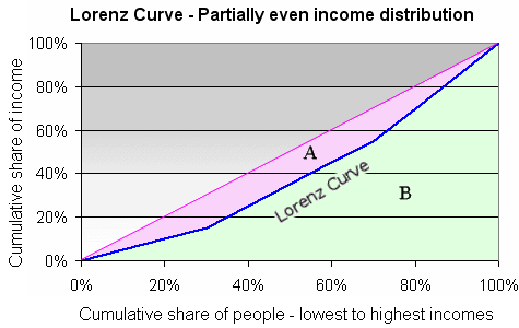
In summary, the bottom 30% of the population earns 15% of the income, while the top 30% earns 45% of the income.
I've shaded 2 regions in the above graph, region A (with light magenta shading) and region B (with light green shading).
Recall the Gini Coefficient is the ratio of the areas:
![]()
Area A = 0.095 (from calculating area B - one triangle and 2 trapezoids - and subtracting it from 0.5)
Area (A + B) = 0.5 (this is half of the rectangle)
So the Gini Coefficient in this case is:
![]()
Let's take it another step. The three richer guys (H, I and J) have a fight and J wins. He demands 50% of the income and leaves it to H and I to distribute the rest.
Then H and I have a fight and I wins. He wants 33% and gives 10% to H and they decide to give what's left (1% or $1 a day) to each of the rest of the village.
(Millions of people live on less than $1 per day.)
| Person | Proportion of population (%) | Cumulative proportion of population (%) | Income (%) | Cumulative income (%) |
|---|---|---|---|---|
| A | 10% | 10% | 1% | 1% |
| B | 10% | 20% | 1% | 2% |
| C | 10% | 30% | 1% | 3% |
| D | 10% | 40% | 1% | 4% |
| E | 10% | 50% | 1% | 5% |
| F | 10% | 60% | 1% | 6% |
| G | 10% | 70% | 1% | 7% |
| H | 10% | 80% | 10% | 17% |
| I | 10% | 90% | 33% | 50% |
| J | 10% | 100% | 50% | 100% |
Now we have a very uneven income distribution. The bottom 70% of the population earn only 7% of the income, while the top 30% earn 93% of the income.
Here's the graph.
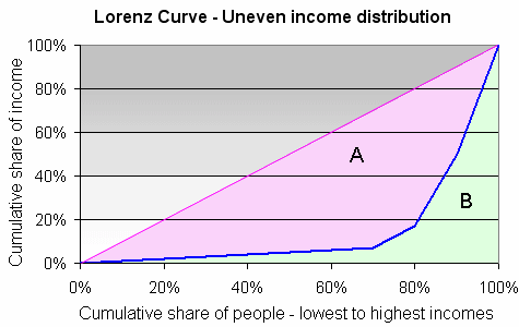
The Gini Coefficient for this situation is very high:
![]()
Finally, let's take the extreme case, where "Person J" becomes a dictator and decides all the income should go to him and everyone else gets nothing.
The cumulative income is 0% for Persons A to I, then it jumps up to 100% for Person J. Here's the graph.
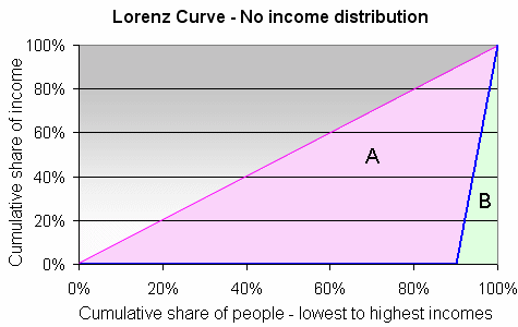
This time area A is very large and the Gini Coefficient is:
![]()
Why isn't it equal to 1?
The highest possible Gini Coefficient is 1 and this implies 1 person gets all the income.
In our story, we only have 10 people in our example population. If there were, say, 100 million people in the country, and one person had all the income, then the Gini Coefficient would be 0.999999, or very close to 1.
Using Calculus to find the Gini Coefficient
The above story is simplified and with a large data set, the Lorenz Curve will appear to be a curve, not a series of straight lines.
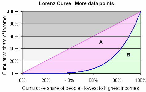
This time I have modeled the Lorenz curve using:
Cumulative share of income = (cumulative share of people)5
(I've used this since the curve y = x5 is close to the shape of the curve we have in the above graph.)
If we use I (for income) and P (for people), this would be written
I = P5
We find the area A using the following:
This gives:
![{0.5}-{{\left[{\frac{{{P}^{6}}}{{6}}}\right]}_{0}^{1}}={0.5}-{0.16667}={0.33333}](https://www.intmath.com/images/img_tex2png/the-gini-coefficient-of-wealth-distribution-4187_5382.png)
So the Gini Coefficient in this case is very high, at:
![]()
Gini Coefficients in Various Countries
These are sorted highest (worst equality) to lowest (best equality).
| Country | UN Gini Coefficient | Rank |
|---|---|---|
| Namibia | 0.743 | 1 |
| Sierra Leone | 0.629 | 3 |
| Haiti | 0.592 | 7 |
| South Africa | 0.578 | 10 |
| China | 0.469 | 34 |
| Singapore | 0.425 | 51 |
| United States | 0.408 | 58 |
| India | 0.368 | 76 |
| United Kingdom | 0.360 | 83 |
| Australia | 0.352 | 86 |
| Japan | 0.249 | 110 |
| Denmark | 0.247 | 111 |
China's coefficient is quite high and this is causing a lot of concern. The Eastern provinces are now well-developed and responsible for most of the income growth, whereas the rural west is still quite poor.
You can see the full list here: Gini Coefficient by Country.
Singapore's Case
Here's the coefficient for Singapore over the last decade. The rapid rise from 2002 and spike in 2007 were due to several factors, including rapid population increases (through immigration) of higher-income people, and a subsequent boost in the overall economy.
The drop in 2008 and 2009 is due to the Global Financial Crisis, where many high-paying jobs either disappeared, or bonuses were slashed.

Information source for graph: Straits Times, Singapore
Further Reading
You may also be interested in: Database of Happiness.
See the 52 Comments below.

11 Mar 2010 at 10:15 am [Comment permalink]
The Gini coefficient for the US, of .408, in the table, above, is quite out of date. That number predates the Republican tax cuts that shifted income from the middle class radically to the rich. We now have a Gini coefficient that is closer to .50 and will not recover from this Great Recession until we redress this issue.
12 Mar 2010 at 5:36 pm [Comment permalink]
Thanks, Ian. I meant to mention the age of the data when I wrote the article.
Most Gini Coefficient data is going to be approximate. In countries where barter systems are common, it would be very difficult to come up with a meaningful Gini Coefficient. Same thing for war-ravaged countries.
But your point is certainly true - I never did understand why Bush (and Reagan before him) was hell-bent on taking from the soon-to-be-poor and giving to the already-rich.
25 Jul 2010 at 9:48 pm [Comment permalink]
I'm in a masters program studying post-conflict environments. Would you have any idea what the Gini coefficient is for Iraq? Or how I can estimate?
Thank you for your time. Excellent explanation.
28 Jul 2010 at 10:08 am [Comment permalink]
Hi Steve. Sounds like a very interesting Masters program.
Now, what is the Gini coefficient for Iraq? This compilation sidesteps the issue with "NA", as it does for several impenetrable countries like North Korea.
Estimating Gini coefficients for any poverty-struck, politically unstable or war-torn country is nigh-impossible.
My only suggestion would be to talk about the pre-2003 invasion period, and to estimate it on "similar" countries in the region (I'm probably going to make wildly inappropriate cultural gaffes here, for which I apologize). Iran arguably is run by a small elite that (no doubt) holds the reins to the bulk of the oil wealth and arguably (again) it was the same situation in Iraq. So given the estimates of around 43 to 44 (by UN/CIA) for Iran, that may serve as a proxy for Iraq's case, pre-war.
But then again, that estimate could be out ±50%!
Good luck with your research.
31 Aug 2010 at 10:53 pm [Comment permalink]
Excellet review and explanation of the Gini coefficient.
25 Sep 2010 at 9:55 pm [Comment permalink]
the gini co-efficient does not consider whether it is a rich or poor country been dealt with.
25 Sep 2010 at 10:25 pm [Comment permalink]
That is correct, Adu. Gini Coefficient is only concerned about the spread of the wealth, not the total wealth.
5 Jan 2011 at 5:16 am [Comment permalink]
I am trying to understand just where South Africa ranks on the Gini coefficient calculation. Usually its numbers are near the top. Why would there be such a difference between the UN and the CIA calculations for South Africa?
5 Jan 2011 at 9:05 am [Comment permalink]
@Wendell: The Gini at best is an estimate, even for highly organized and controlled countries. (How do "the authorities" know how many people have millions stashed away in off-shore bank accounts?)
South Africa still has millions of people living in poverty and probably there is little record keeping for such cases. I imagine a lot of whites kept their wealth outside of South Africa before and after Mandela came to power.
Hence UN and CIA estimates are going to be wildly out.
16 Jan 2011 at 8:23 am [Comment permalink]
Murray,
There is a big difference between the Gini Coefficient based on wealth compared to that based on income. While today 2011, the gini coefficient based on income for the US is close to 0.5, give or take 0.02, the gini based on wealth distribution (household net worth) is close to 0.85 -- I believe that it has crept up from 0.834 to 0.865 from 2007 to 2009 -- see Wolff - Recent Trends in Household Wealth in the United States
Also read an interview with Wolff -The Wealth Divide The Growing Gap in the United States Between the Rich and the Rest
While income may denote the ability to live day to day in normal times, wealth denotes the ability to survive when the times are bad. Also wealth, as opposed to income is a measure of the potential political power of the individual/household
16 Jan 2011 at 11:24 am [Comment permalink]
Really interesting articles, Rajiv and thanks for sharing.
It looks to me like the US is headed for some serious re-adjustment. Few societies survive income and wealth disparities like theirs. The anger against the banker bonuses was only the beginning.
29 Mar 2011 at 1:49 pm [Comment permalink]
I see a lot of talk about tax cuts and increased inequality. Government spending is now near 45% and the income gini is in the 0.45-0.5 range. In 1911 government spending at all levels was under 5%, transfers were essentially zero, and the income gini was in the 0.4-0.45 range. Any thoughts on the role of bureaucratic waste, corruption through tax credits and subsidies to the wealthy, regulation biased towards the wealthy, immigration from poor countries, and trade with poor countries? Maybe income gini is not a even useful measure if the question is how to reduce poverty.
11 Jul 2011 at 8:31 pm [Comment permalink]
Hmmm...Aside from the various ruling elites fudging the numbers--I'll lay odds that any 'official' stats from the old CCCP would give a number close to 0, even though as a matter of practicality, the entire wealth of the country was in the hands of only a very small cadre of Party members!--there is the problem of standards. What is 'too high' a value, and on who's authority? What about too low? If the analogy is to thermal distribution in gasses, where almost all the work is done by a small portion of very energetic molecules, then perhaps what a society needs is a greater inequality of wealth distribution! As an example, it was Paul Allen, Microsoft partner, who funded the first private vehicle to get a man into space and back, not me--as much as I would have liked to!
pgf
11 Jul 2011 at 9:14 pm [Comment permalink]
@Peter: Yes! If it is difficult (impossible?) to get an "accurate" Gini for the advanced countries, how meaningful is it for developing ones, especially those that still hang on to some communist ideology.
I've seen a few articles on the growing Maoist revival in China - now that will be interesting to watch.
6 Oct 2011 at 4:25 am [Comment permalink]
See here for an up-to-date blog entry on the GINI Index:
http://www.oneutah.org/2010/09/the-gini-index/
11 Mar 2013 at 2:28 pm [Comment permalink]
The title says "wealth" but the table of Ginis seems to be "income." Confusing.
11 Mar 2013 at 2:48 pm [Comment permalink]
@Tony61: Rajiv mentioned this dichotomy in an earlier comment. Yes, we are assuming income distribution is roughly correlated to wealth distribution, but this does not hold for many societies.
28 May 2013 at 10:33 pm [Comment permalink]
Congratulations to Murray for providing a very clear explanation of the Gini coefficient.
I would like to see the source of the UN Gini numbers. Using US government data on income (not wealth), one gets a Gini coefficient for all income earners of about 0.5 from 1995 to the present with some small fluctuations but no overall trend. If the UN is talking about income, then I don't know where they get their numbers. Their value of 040 is strongly inconsistent with the US government numbers. I don't know the US Gini for wealth, so if the UN is looking at wealth, then maybe that explains the difference.
For those readers interested in relating the changes in the Gini coefficient over time to US politics, there was a slight downward trend from 1994 to 2008, and after that a slight upward trend. I see no obvious connection to any particular tax policies.
21 Jun 2013 at 10:16 am [Comment permalink]
[...] The Gini Coefficient is a measure of inequality. It’s well described on its wiki page and also with more simple examples here. [...]
4 May 2014 at 12:32 pm [Comment permalink]
Thanks Murray... Can the Gini Coeficient and Lorenzt Curve could be applied in Tax or country fiscal policy? How?
Thanks
Amri Wirabumi
4 May 2014 at 6:27 pm [Comment permalink]
@Amri: Well, I guess every government tries to keep in mind the current distribution of wealth before coming up with a fair tax system. (And of course, some governments deliberately design an unfair system, and that is very sad.) They know that income equality (or the impression of income equality) is important for social harmony.
24 Nov 2014 at 5:58 am [Comment permalink]
[…] (5) http://www.investopedia.com/terms/g/gdp.asp (6) Gini (7) http://data.worldbank.org/indicator/SI.POV.GINI (8) […]
8 Jan 2016 at 9:52 pm [Comment permalink]
What if i have to compute gini coefficient without being given any number? Or how can i use my own assumed numbers to compute gini coefficient? Please can i be helped..
9 Jan 2016 at 11:02 am [Comment permalink]
@Glory: You could follow the same steps I do in the article. Put your values into a table and then find the cumulative frequency.
13 Jan 2016 at 3:49 pm [Comment permalink]
Well, the information on Singapore is totally out as you did not consider the net effect after Taxes and Transfers, a latest article dated Aug 21, 2015 has concluded that many of these countries, such as the United States, Australia, and Germany, actually have greater income inequality than Singapore. However, their taxes and transfers have done a better job of reducing inequality, to the point where they now have a narrower gap than Singapore. Thank you for your special interest on Singapore, that little red dot.
http://themiddleground.sg/2015/08/21/gini-coefficient-bad-income-inequality/
13 Jan 2016 at 4:01 pm [Comment permalink]
@Jack: I mentioned several times in the comments already that any calculation for Gini coefficient is approximate - for advanced or developing countries. Interesting to ponder, but not possible to conclude anything with any great certainty.
20 Apr 2016 at 2:55 am [Comment permalink]
Thank you for the insightful information. I have a question? What would happen to the Gini Coefficient if the government gave a one off payment of $1,500 to all households in a country? Would the income distribution get better or worse?
20 Apr 2016 at 7:30 pm [Comment permalink]
Hello Joanna
The Gini distribution wouldn't change since it takes into account the way the wealth is shared, not the total value of that wealth.
5 Aug 2016 at 3:00 pm [Comment permalink]
I was going to ask how I could approximate a formula for the Lorenz Curve given the Gini, but I think I figured it out.
If we assume a curve of the form
y=x^n
then n=0 gives the equality line and the higher n, the greater the inequality, larger A, smaller B etc.
Finding the integral of y=x^n, evaluate at x=1, then
B=1/(n+1)
Now G=1-2B, so
G=1-2/(n+1)
Rearranging,
n=2/(1-G)-1
so
y=x^(2/(1-G)-1)
will provide an approximation to y given x and G.
Voila.
7 Aug 2016 at 8:31 am [Comment permalink]
@John - Interesting, and it does give a range of reasonable-looking curves. The challenge now it to ensure your curve goes through (0,0) and (0,1).
8 Aug 2016 at 7:57 am [Comment permalink]
It works because 0^n=0, 1^n=1, and x^0=1.
9 Aug 2016 at 3:18 pm [Comment permalink]
My bad - I looked at it in a rush. Yes - it certainly does work and I like it. Clever!
Here's how it looks in Desmos: Lorenz Curve - Gini Coefficient model
24 Aug 2016 at 9:30 am [Comment permalink]
Thanks. The view in Desmos is instructive. It seems like it may be a little flat at the lower end, i.e it would be better if it was a bit more spherical than parabolic. Not sure how to do that. I want to use it as a quick way to approximate the income distribution given the gini for a large number of countries. Any ideas?
24 Aug 2016 at 10:32 am [Comment permalink]
I believe you mean "circular" rather than "spherical".
Considering the curves given at the bottom of this page, http://www.physics.ucla.edu/~chester/GINI/, I think your parabolic model is actually not bad at all. None of those idealized curves is circular.
By "approximate the income distribution", do you mean something like determining how much of the wealth the top 20% owns?
25 Aug 2016 at 8:53 am [Comment permalink]
Yes, circular, silly me. But really, quadratic.
I am thinking we can generalize the equation to
y=ax^n+bx, where a+b=1.
This still has the nice properties of passing through (0,0), (1,1) and y=x when n=1.
Evaluating the integral at x=1 and using G=1-2B gives
n=(2a/(1-b-G)-1 so
y=ax^((2a/(1-b-G)-1)+bx
My guess is that a=.9, b=.1 might work a bit better than assuming a=1, b=0 as before. Could you possibly plot that in Desmos please?
I should estimate a and b from real data. However given that many people in poor countries may subsist
on little or no income, b=0 may not be too inaccurate. Cheers.
PS I plan to use UN income data to try to look at the effect of changes in the income distribution on expenditure.
4 Sep 2016 at 3:42 pm [Comment permalink]
@John: Your second attempt looks good, too. Here's how it looks in Desmos: https://www.desmos.com/calculator/1jlkmb7kk9 It falls over for high G values, but otherwise works well.
(BTW, Desmos is free and anyone can create an account. I believe you can also modify existing graphs.)
12 Oct 2016 at 11:10 am [Comment permalink]
I was just curious, in you section calculating the Gini Coefficient using calculus, in the example why is cumulative share of people raised to the power of 5?
12 Oct 2016 at 3:45 pm [Comment permalink]
@Liam: Yes, that seemed to come from nowhere. I used that because the curve y = x5 is close to the shape of the curve we have in the graph. I have added a statement to that effect in the article.
6 Jan 2017 at 2:17 am [Comment permalink]
Thanks for a good basic explanation, but when you have a small number in your population, the data does not even come close to approximating to a continuous function, but is instead a series of clearly discrete steps. Thus for your sample of 10 for your second, third, fourth and fifth graphs, the graph should show a series of 10 steps like a bar chart and not a slope.
This leads to a fundamental question: How do you compute the Gini in these circumstances, because as you say
"Why isn't it equal to 1?
The highest possible Gini Coefficient is 1 and this implies 1 person gets all the income.
In our story, we only have 10 people in our example population. If there were, say, 100 million people in the country, and one person had all the income, then the Gini Coefficient would be 0.999999, or very close to 1."
This distinction is very important when you are approximating by considering income bands (say deciles) to determine and compare the different outcomes between policy options at a high level.
However, I haven't seen anywhere on the internet that looks at that conundrum. Can you help?
6 Jan 2017 at 9:10 am [Comment permalink]
@David: My second to fifth graphs do in fact use discrete units. Since I'm explaining how the Gini curve comes about, it would not make sense to use histograms. (The third graph, for example, has 3 distinct portions for the "curve", representing the 3 different income bands in the idealised society. The second curve illustrates the "line of equality" from the first graph.)
The last part is an interesting question. I'm not a policy analyst by any means, so I don't think I can shed too much light on it. This article by the Singapore government (which takes quite a different approach to other countries) may be of interest: Income Growth, Inequality and Mobility Trends in Singapore (PDF).
21 Jun 2017 at 9:45 pm [Comment permalink]
Hi everyone,
I am trying to calculate the Gini for a bunch of cities but only have income bands (meaning how many people fall into $0 - $7,500; $7,500 - $10,000 etc). How would I go about calculating the Gini in this case; would I use the median of each band?
Thank you!
26 Jun 2017 at 6:47 pm [Comment permalink]
Hello Luise. I think using the median would be OK. I suspect each band would need to be the same width(so it would be 0 to 7,500, hen 7,500 to 15,000 and so on.
19 Jul 2017 at 11:49 pm [Comment permalink]
So lets see if I got this straight!
I am working on my master thesis and I have to calculate inequality. Lets say I decide to calculate Gini for my country for the years beginning in 1878 to 1960 (economic History).
I can find total income and population but it is close to impossible to find cumulative share of income earned. Can i still somehow calculate Gini?
To elaborate even more on this if I take your example about the village with the 10 people I can find out total income and population but can not find out income distribution can I still do it?
20 Jul 2017 at 6:32 am [Comment permalink]
@Nikos: Calculating Gini is a challenge even for government statisticians, who usually have access to a lot more information than we do! It sounds like you'll need to dig out some more data before you can proceed. A quick search gave me:
OECD stats (you can go back to 1974 for some coutnries)
World Back Gini historical
Talk on selected country's Gini histories (PDF of PPT)
Good luck with it
19 Aug 2017 at 10:26 am [Comment permalink]
I dont understand how its possible to measure income as you do when one persons income is anothers expense. There cant be $100 income at the end of the day shared between 10 villagers because there is no explanation of where the income came from. If ones income is anothers expense then at the end of the day there can only be zero.
Is it not true that the distribution of wealth has nothing to do with income but debt? Is it not debt we are really speaking about when we concern ourselves with redistribution?
19 Aug 2017 at 3:00 pm [Comment permalink]
@Dean: Is it always the case that "one persons income is another's expense"? You're right if it's a closed system, but it's always possible that income is derived from elsewhere (from investments, for example) and shared among everyone.
Your questions are good ones though. Gini is just one model of relative wealth, and is not without its problems.
19 Aug 2017 at 4:17 pm [Comment permalink]
Thx Zac,
As this is a blog about math I wonder if you might wish to accept a challenge.
I have contended for quite some time that 100% solvency is not possible (and hence there is no possible sweet spot on the political spectrum). When I say 100% I am referring to the whole of the economy incuding households - essentially any entity which has income and expenses.
The problem is I cant prove it with math formulas like economists like to use. I have only been able to prove it from a legal perspective.
Any chance you could help or point to how I could use math to either prove or disprove the contention?
Cheers
22 Aug 2017 at 9:28 am [Comment permalink]
@Dean: I'm not sure that I have enough background in this specific aspect to help you. Any other readers like to take Dean up on his challenge?
20 Oct 2017 at 11:47 pm [Comment permalink]
Is there any excel sheet or software to calculate gini coeefficient for 12 income groups. Thank you very much
21 Oct 2017 at 10:35 am [Comment permalink]
@Sahin. A quick google brought up this one. I don't know if it will do what you need, but give the suggested formulas a try.
21 Oct 2018 at 10:07 pm [Comment permalink]
This is a really great presentation on this subject. Do you have any more posts using math on global issues?
22 Oct 2018 at 7:09 am [Comment permalink]
@Steve: These articles may be of interest (not really the same type of article, though):
Breathing Earth - visual display of world polluters
H1N1 and the Logistic Equation
Real World Math: Engaging Students through Global Issues
Who’s Counting - interesting real-life math applications
Violence in schools - real life statistics